From Product to Platform
How Printique Transformed Its Brand, and Business, For the Next Generation of Creators.
The Backstory
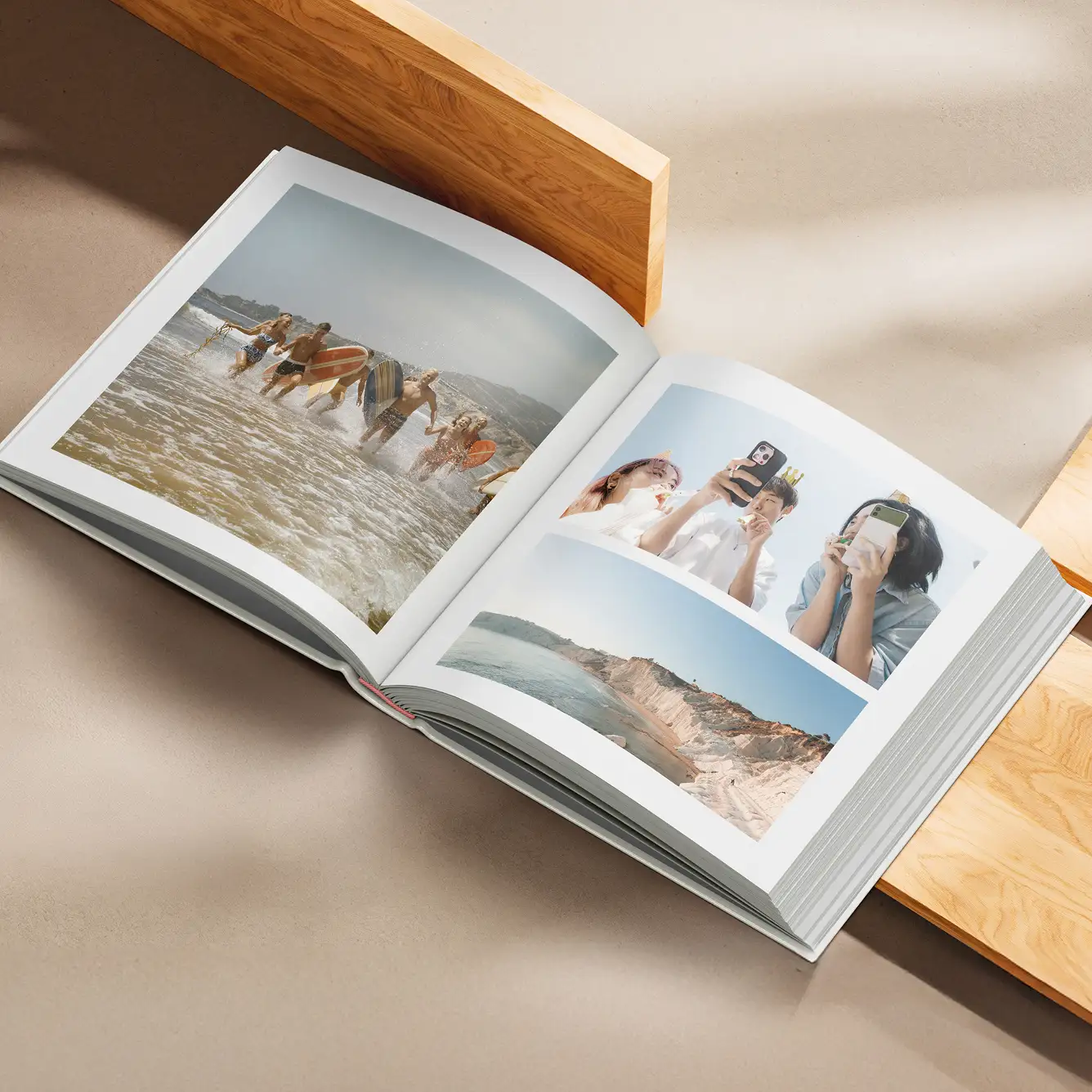
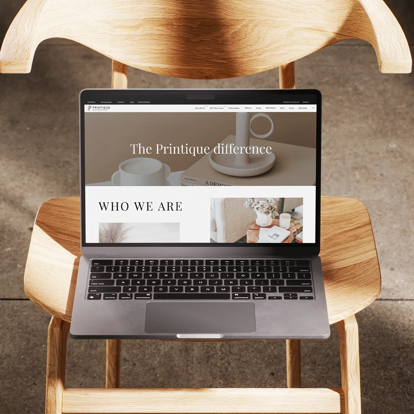
Printique had long been a quiet giant in the premium photo printing space, trusted by photographers, artists, and institutions for museum-grade prints and archival-quality albums. But as consumer tastes shifted and creator economies exploded, Printique’s legacy image was holding it back.
The brand felt dated. The tone was clinical. The experience, while technically sound, lacked the emotional pull and creative warmth that today’s visual storytellers craved.
Behind the scenes, the company was evolving. Printique was building better tools, expanding its creative product line, and embracing deeper community engagement. What they needed was a brand that reflected the premium quality of their output and the passion of their audience.

The Turning Point
Yellow Pebble partnered with Printique to lead a top-to-bottom brand transformation, designed to do three things:
- Reposition the brand from legacy printer to modern creative platform
- Appeal to a new generation of photo-forward users, from influencers to interior designers
- Build the systems and assets to scale across digital, print, and retail
This wasn’t just a visual refresh, it was a strategic rethink of how Printique showed up in a saturated, aesthetic-first marketplace.
Our Work
01: A Strategy Rooted in Emotion
We started with foundational research—unpacking customer behaviors, aesthetic drivers, and emotional motivators behind photo printing in the digital era.
What we found was clear: people weren’t just printing photos, they were curating their legacy, telling their stories, creating tactile joy.
This insight reframed the brand from being about “formats” to being about “moments that last.”
We translated this into:
- Brand Strategy & Voice Guidelines
- Audience Personas for Gen Z Creators, Millennial Memory-Makers, and Design-Forward Parents
A differentiated brand promise: Crafted to Endure. Designed to Remember.
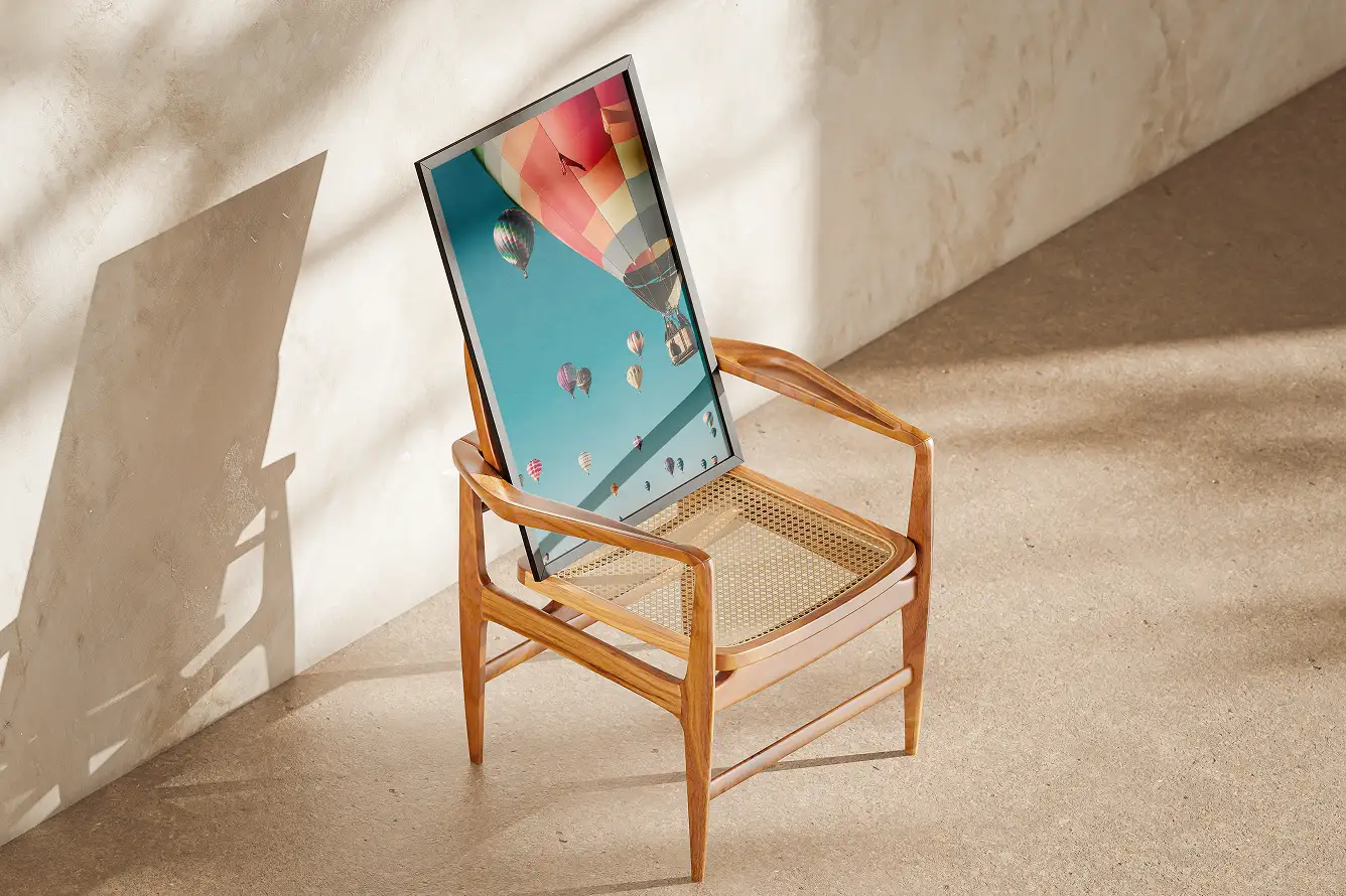
02: A Visual & Verbal Identity That Could Flex
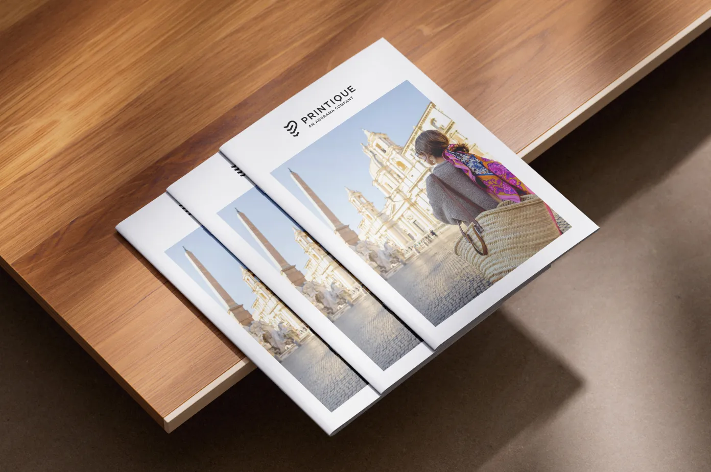
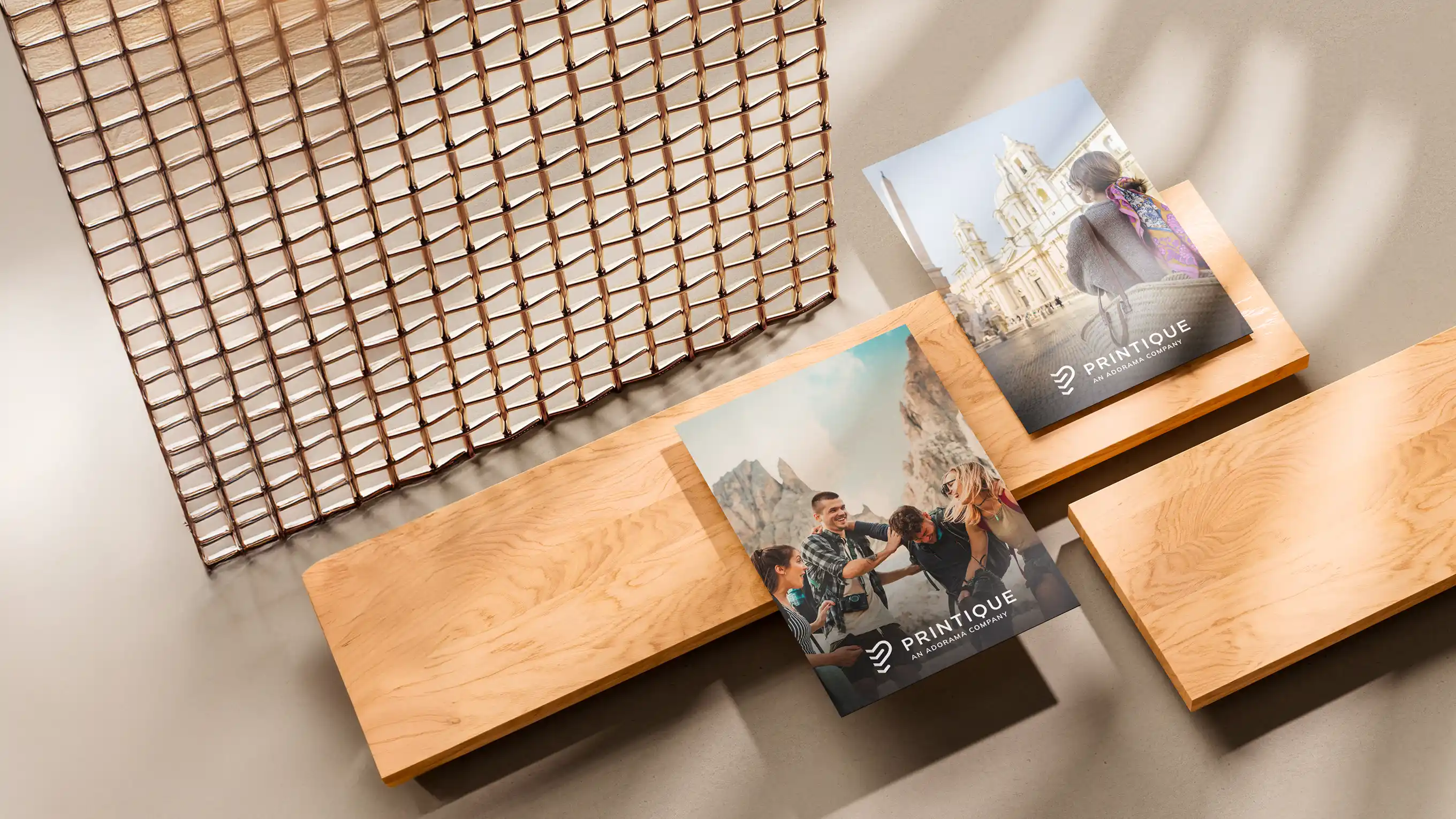
The new identity needed to balance elegance with warmth, craft with creativity. We delivered:
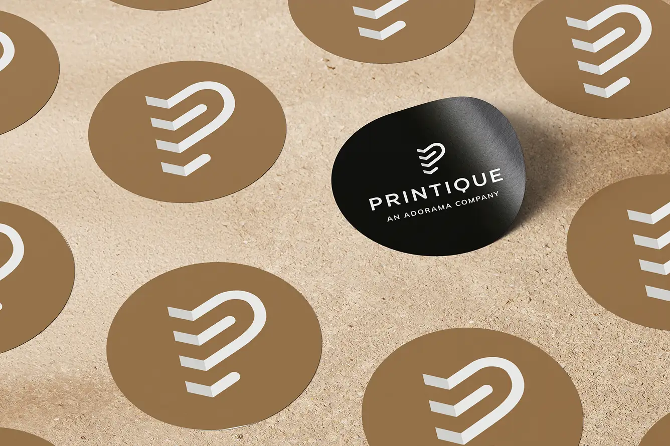
- A refreshed logo system that modernized the brand without abandoning equity
- A modular type & color system built to work across product packaging, emails, social, and partnerships
- Tone-of-voice libraries that allowed the team to write with more warmth, clarity, and editorial flair
The rebrand extended into:
- New packaging concepts
- Email & social templates
- Product messaging that centered on emotion over specs
03: From Print Shop to Creator Ally
Beyond brand identity, we helped Printique reposition itself within the broader creative and lifestyle ecosystem.
This included:
- Articulating new value props for influencers, home stylists, wedding photographers, and corporate gifting
- Building marketing toolkits for collabs and creator partnerships
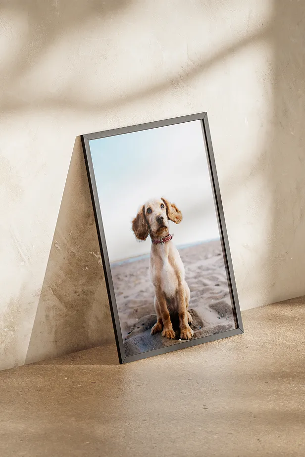
- Creating content formats that let real users tell their stories, through their prints
The result was a brand that didn’t just showcase product quality, but championed the creativity of its community.

The Results
Metric
Outcome
Elevated Brand Positioning
Audience Expansion
Internal Alignment
Creator Economy Activation
Why It Matters
In a category flooded with sameness, Printique found its edge by remembering what others forgot:
People don’t just want prints.
They want presence. Beauty. Tangibility. Memory.
Yellow Pebble helped Printique reframe its brand not as a utility, but as a creative ally, offering permanence in a swipe-and-scroll world.
From lab to lifestyle, Printique is now positioned to inspire.
One story, one print, one frame at a time.


Let’s Build What’s Next
We partner with the thinkers, builders, and innovators shaping the industries of tomorrow. Together, we turn ambition into brand power, and ideas into influence.
Talk to us